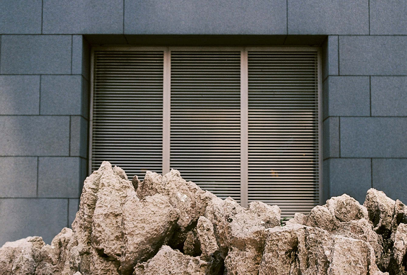
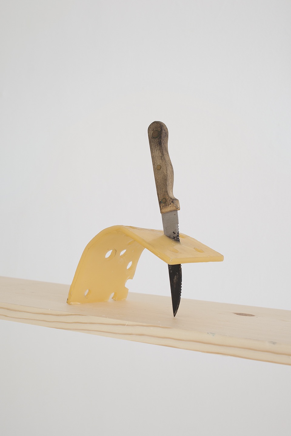

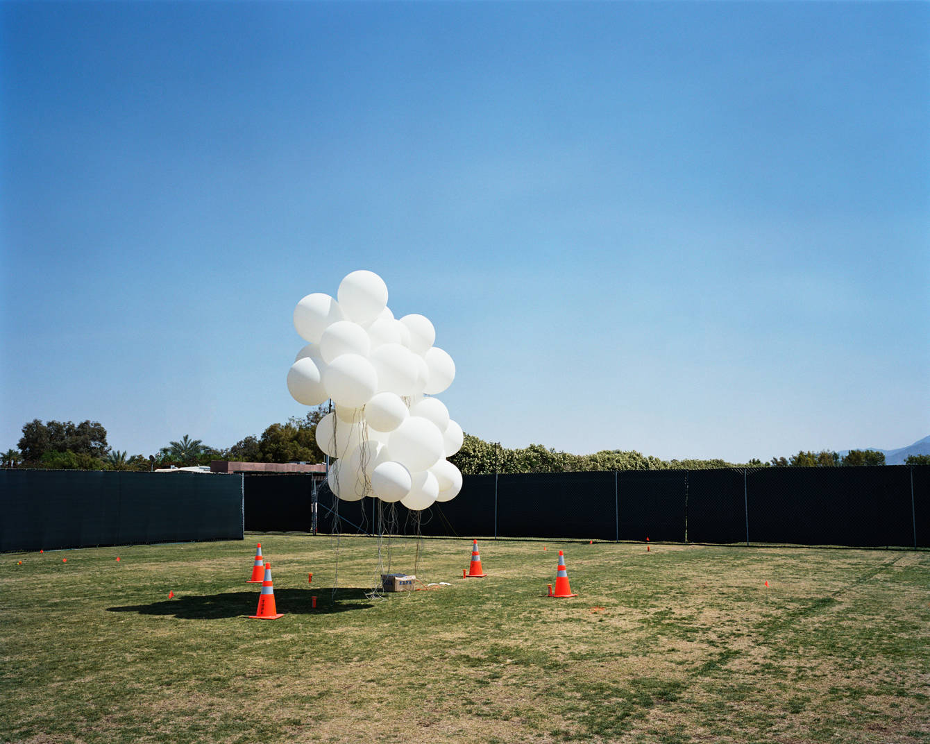
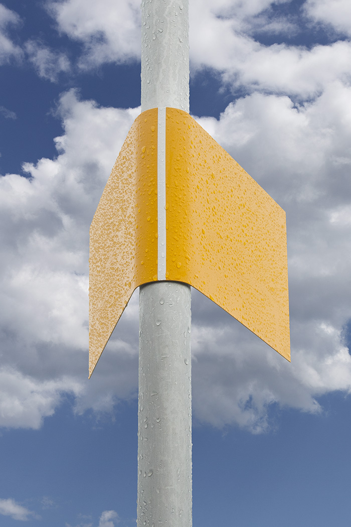
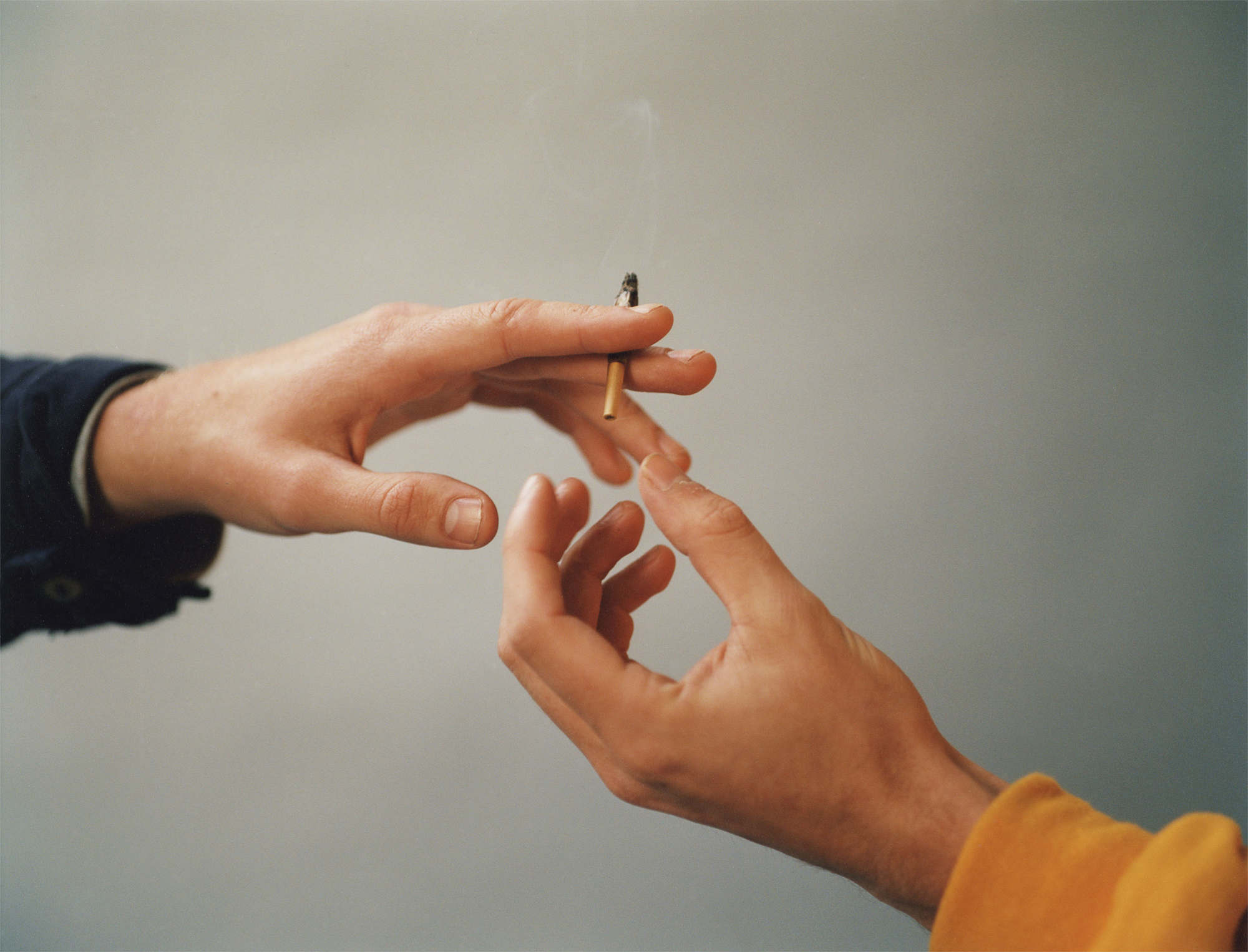
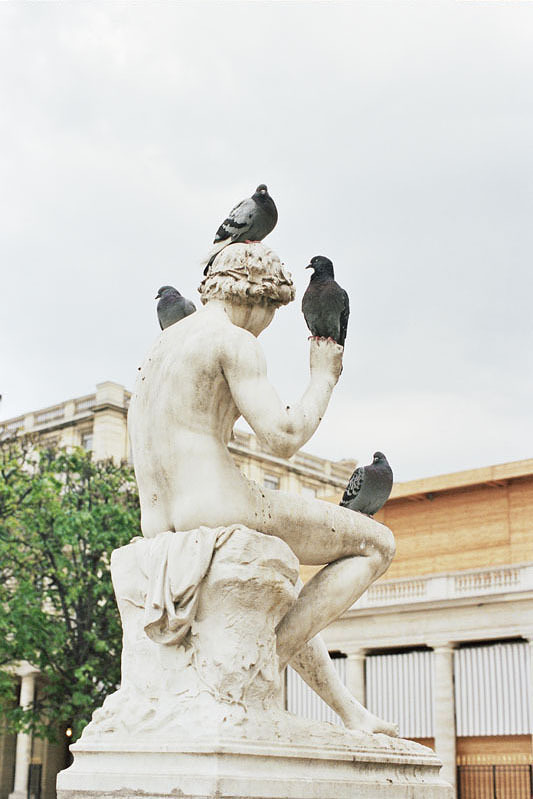
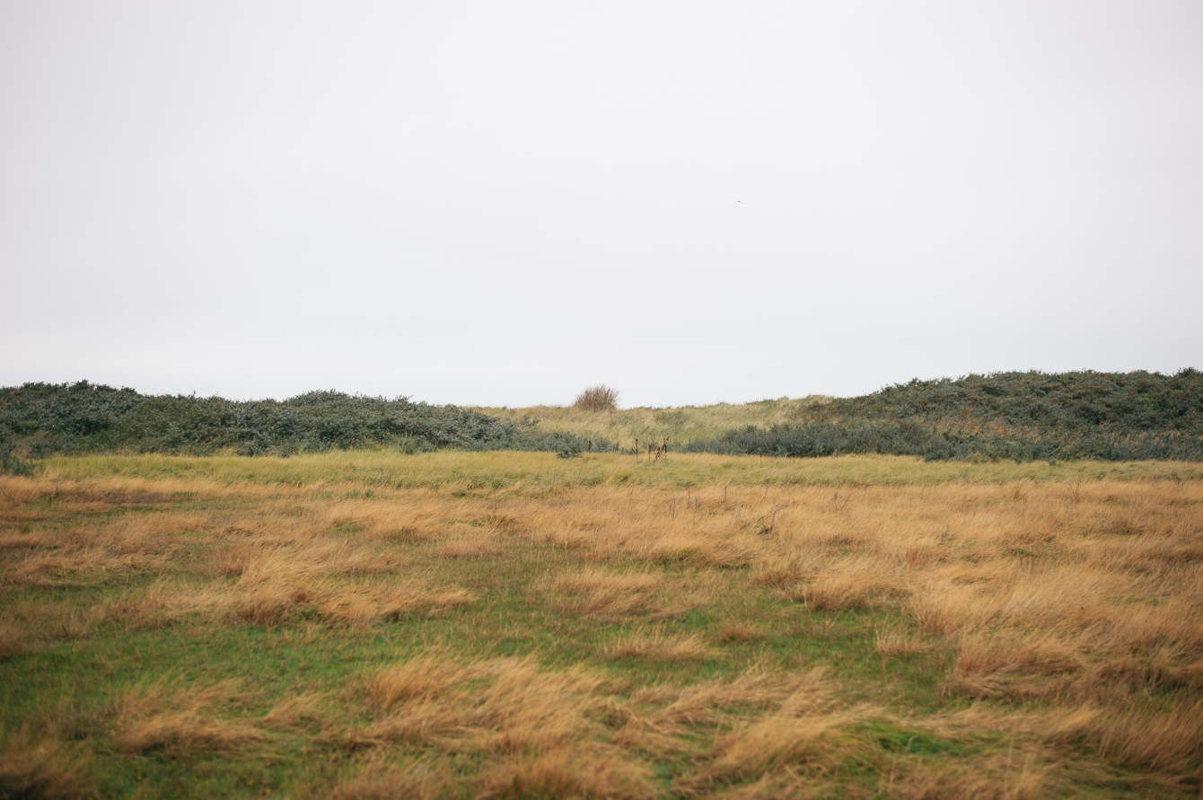


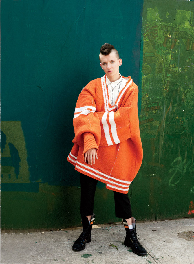


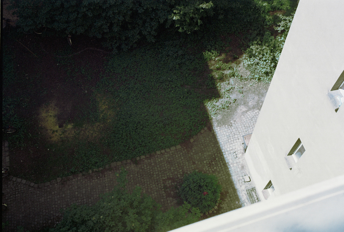
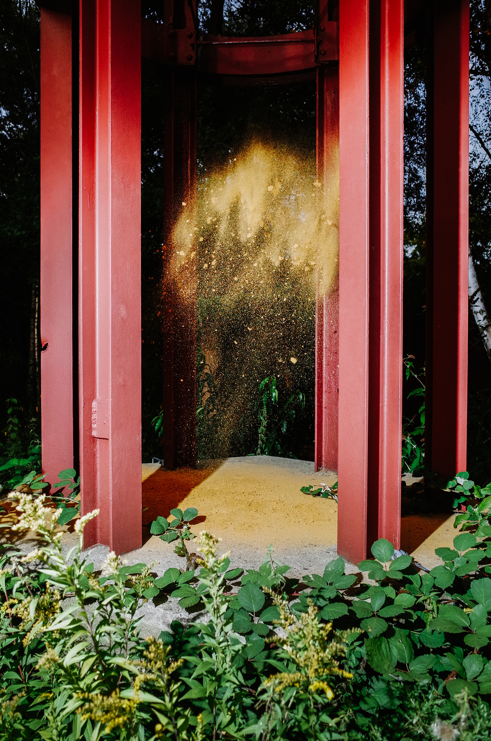
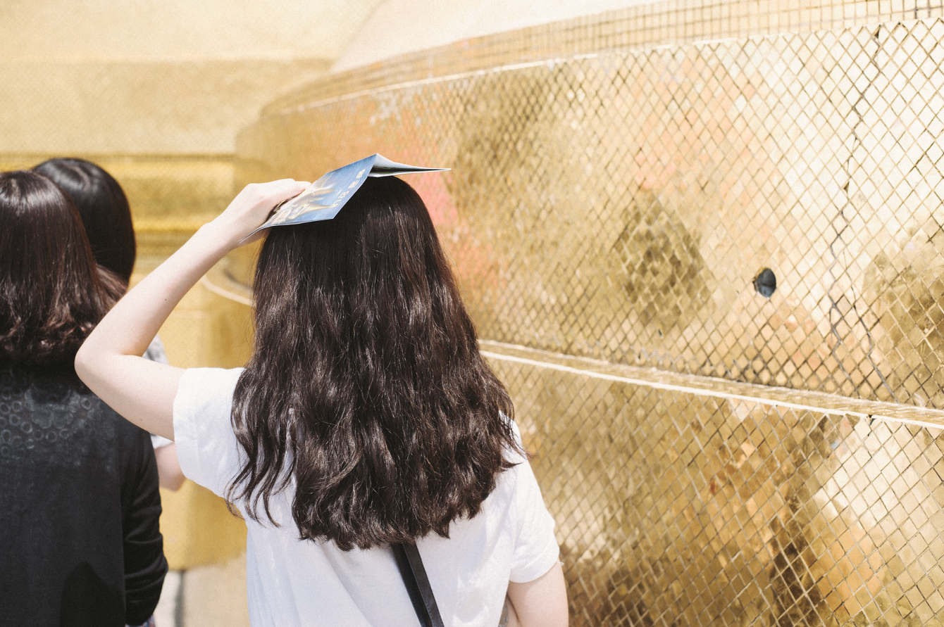
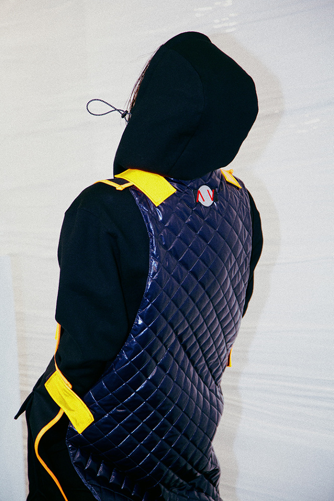
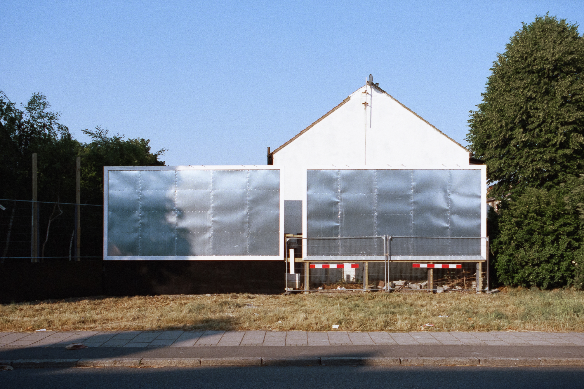
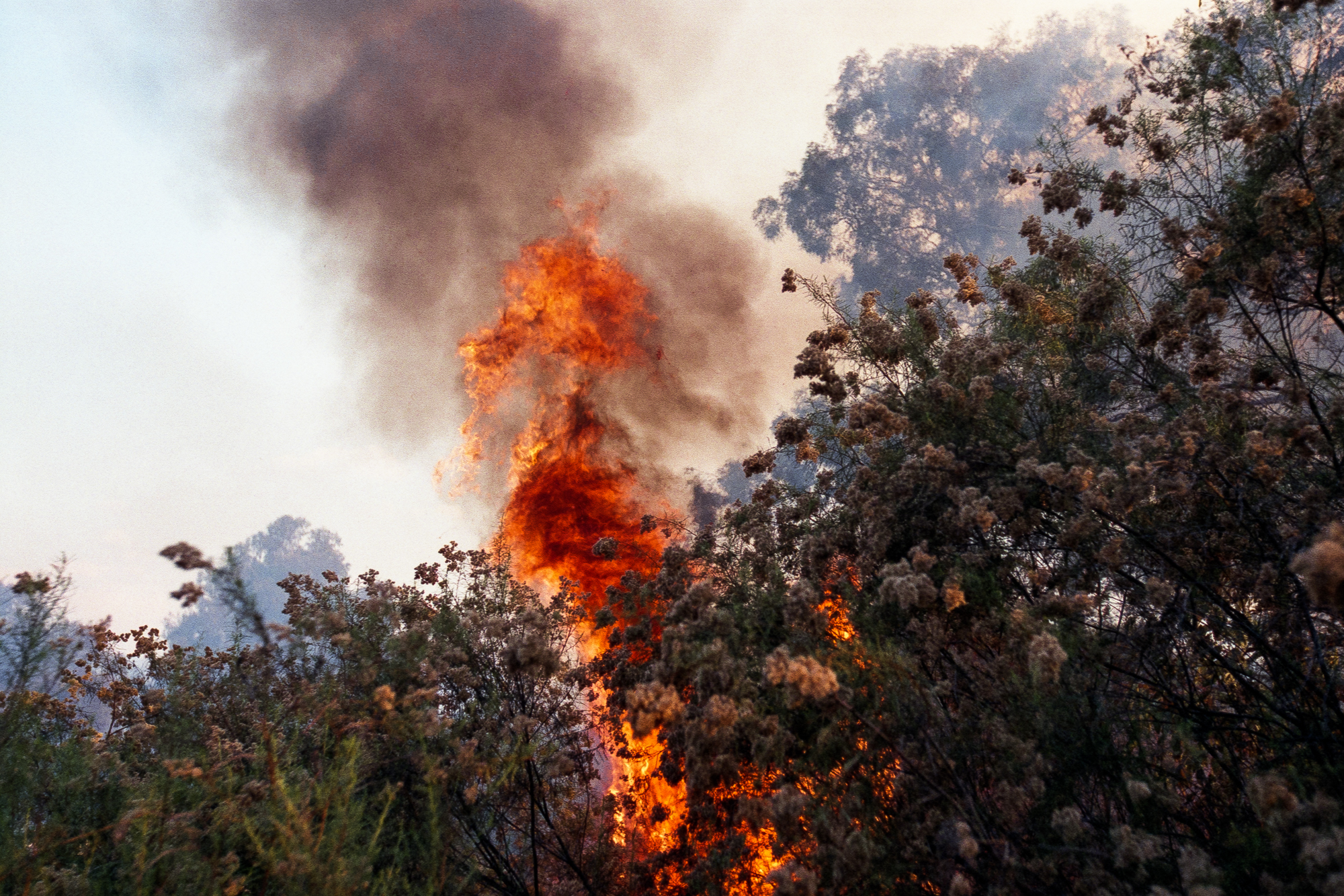
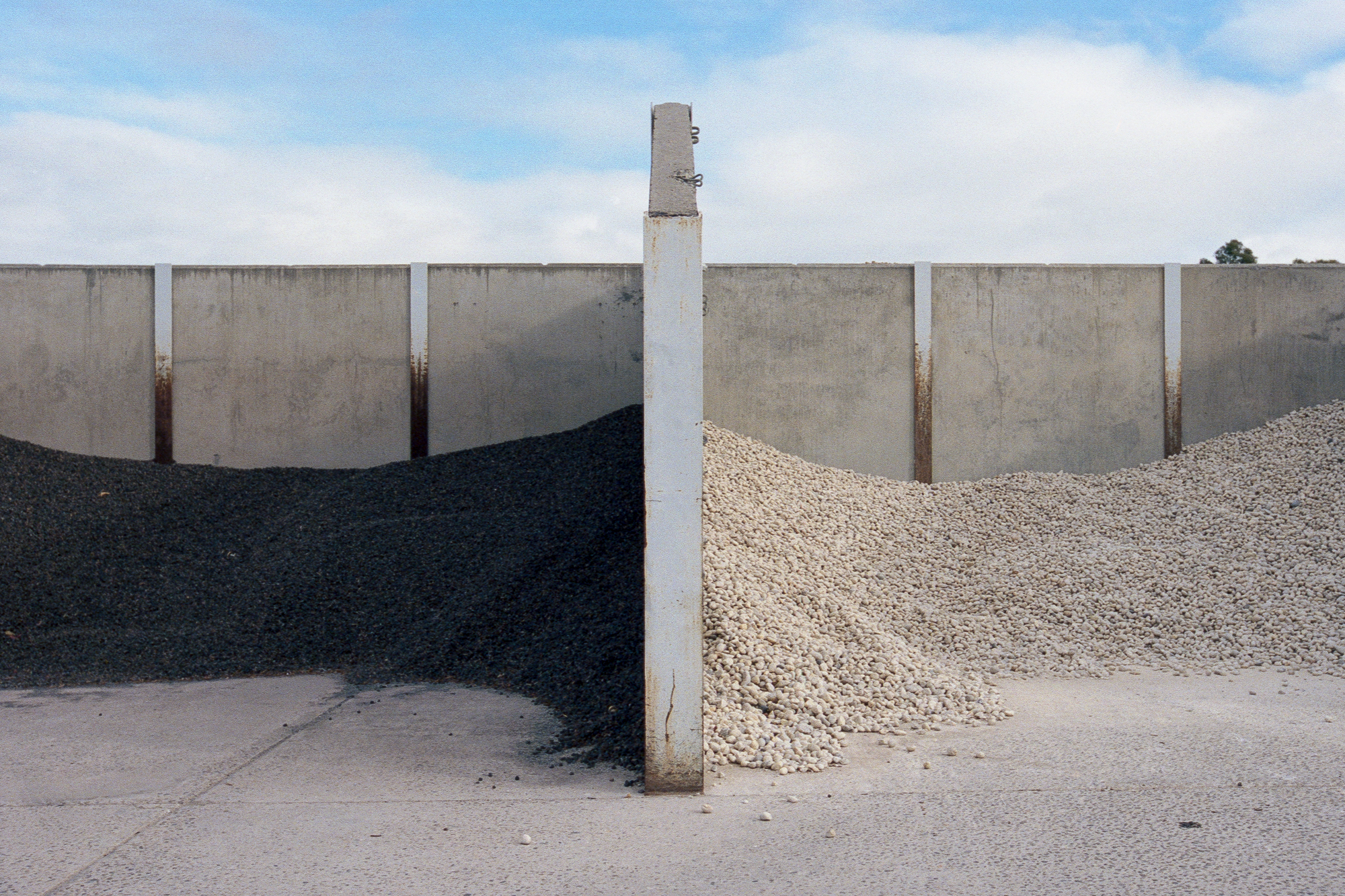
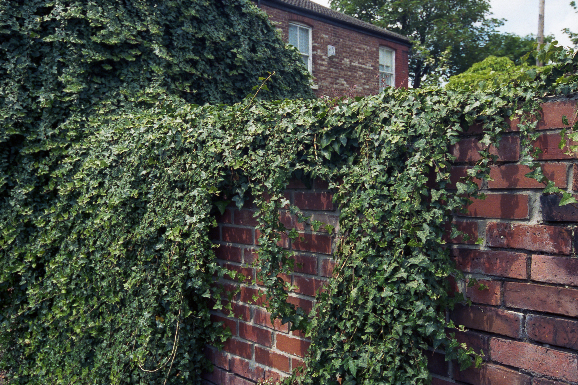
No one compliments a photograph on the precision of it’s corners or the parallelness of its sides, much in the same way that no one compliments humans on the general rigidity of their hidden structures and biases. Yet it remains true that the borders of a photograph, like the prejudices of consciousness, are so defining, so rigid, so focus-making that both a “photograph” and a “human” would literally be nothing without them. No parameter ︎ no thing.
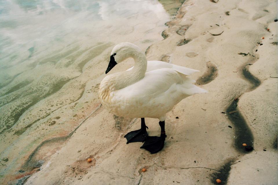
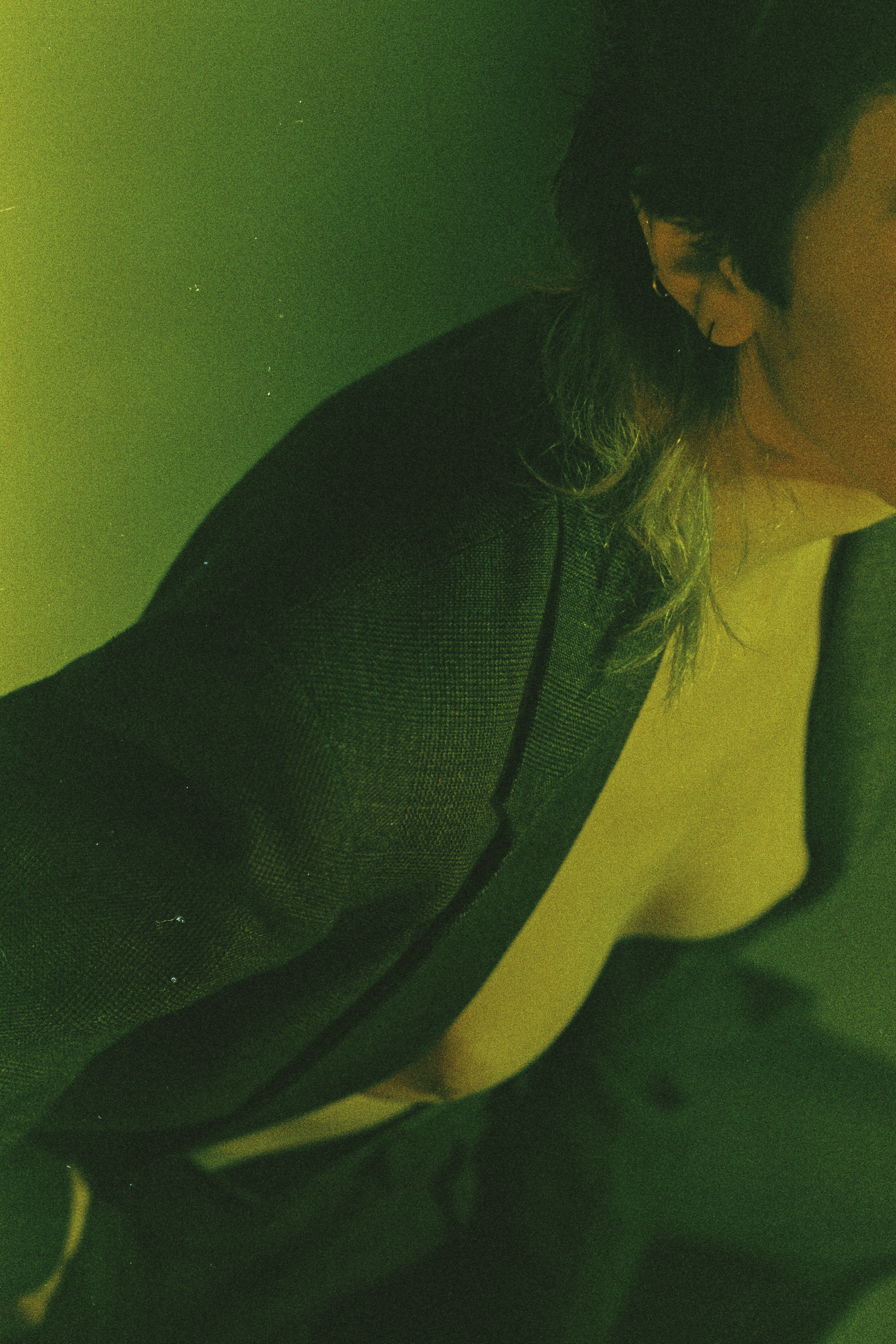
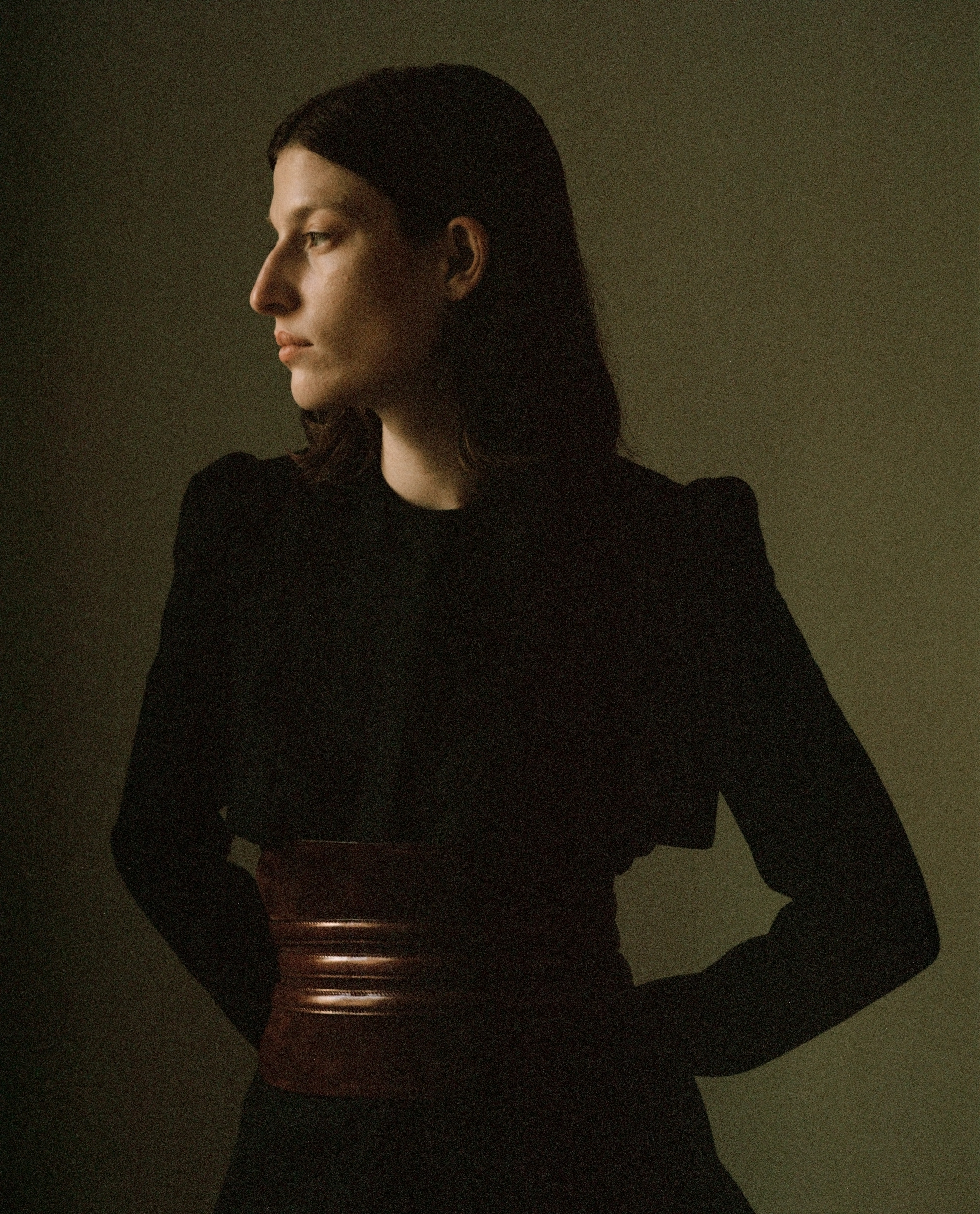
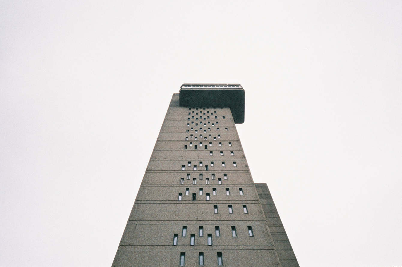
In the photographs of Jamie Hladky there seems to be an inherent understanding and use of this hidden parametric. The typically clear, guiding subject is absent; the viewer is not escorted to a center and meaning; this puts uncanny emphasis on the usually hidden outline. This frame seems to momentarily rest on a situation rather than defining one — this is lovely and sort of like magic.
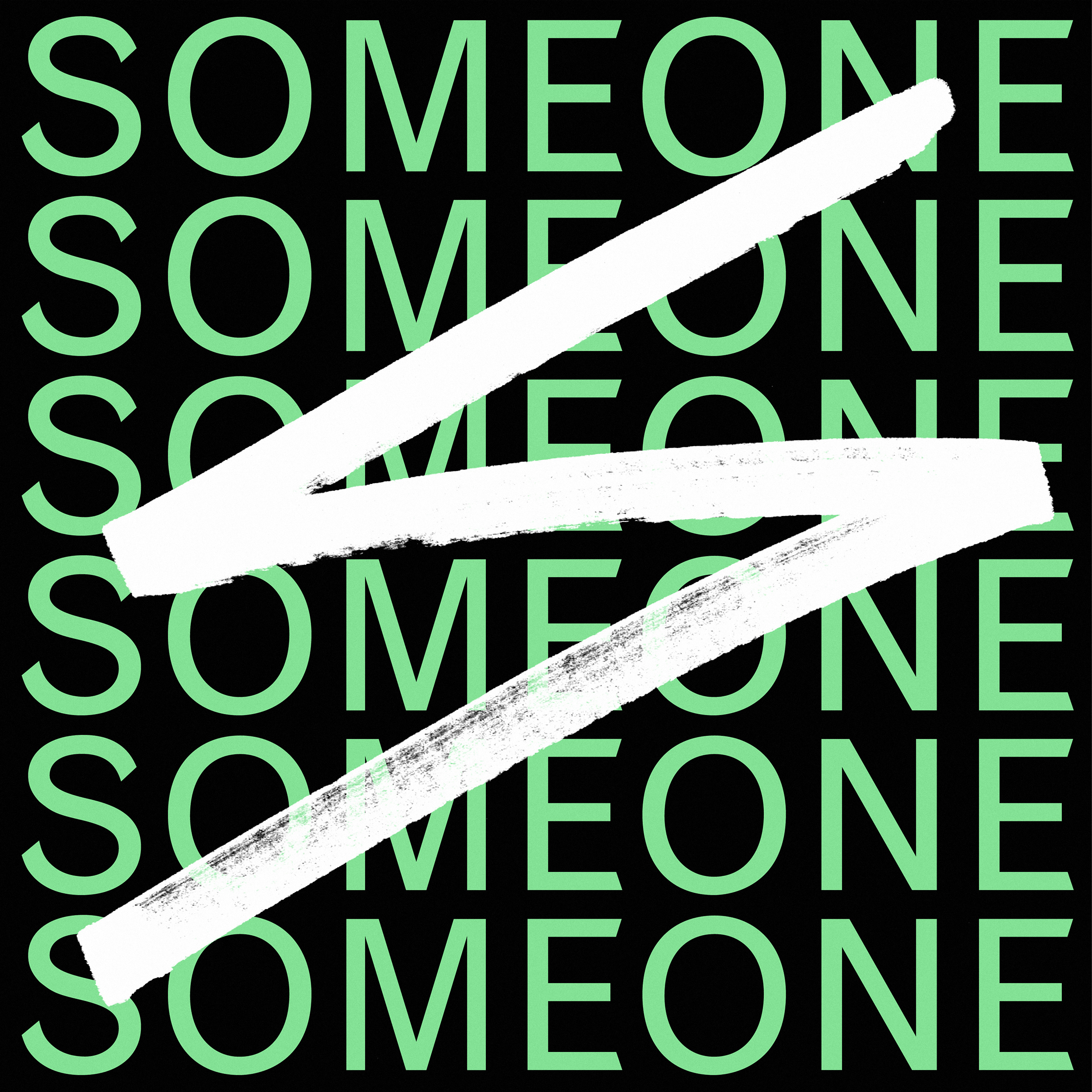
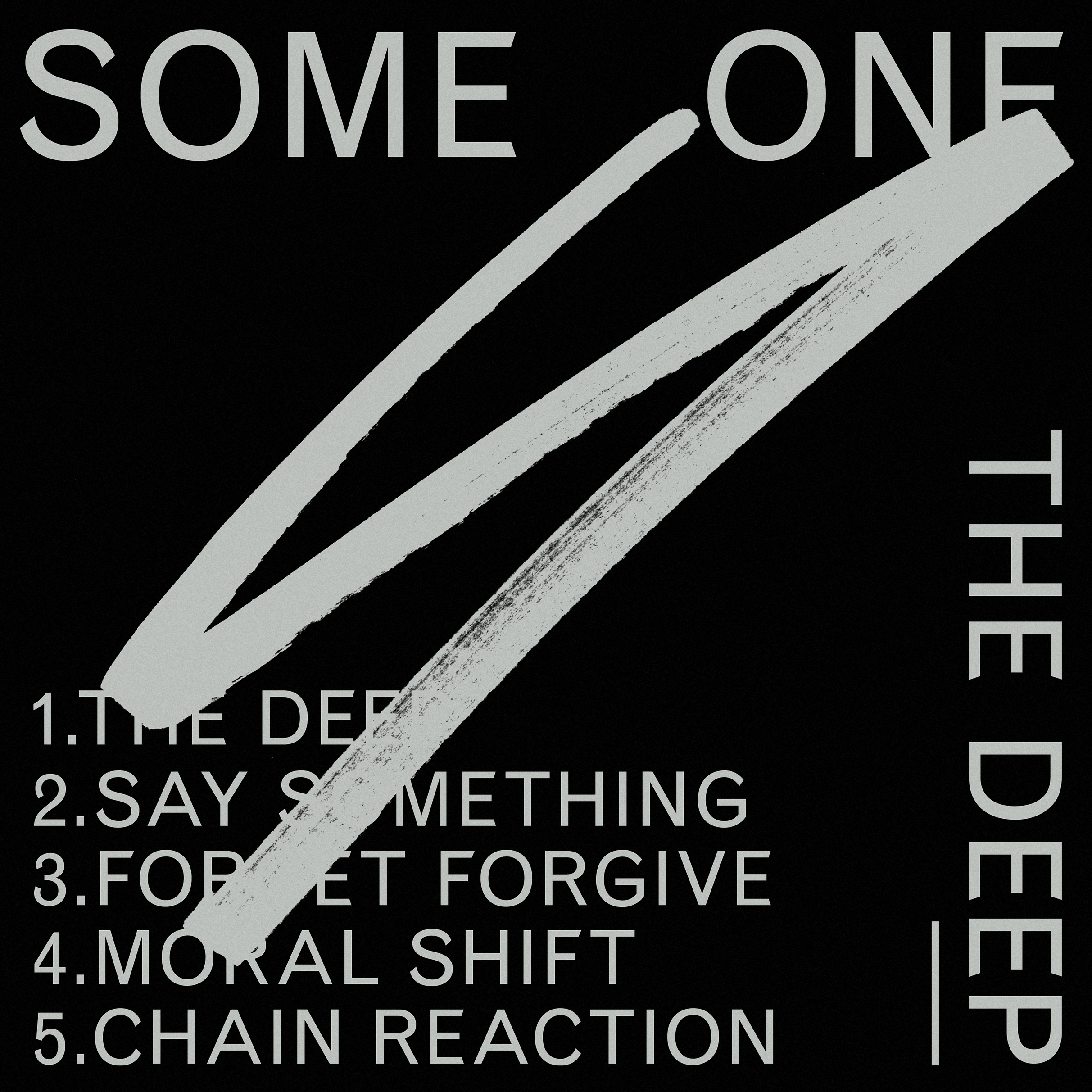
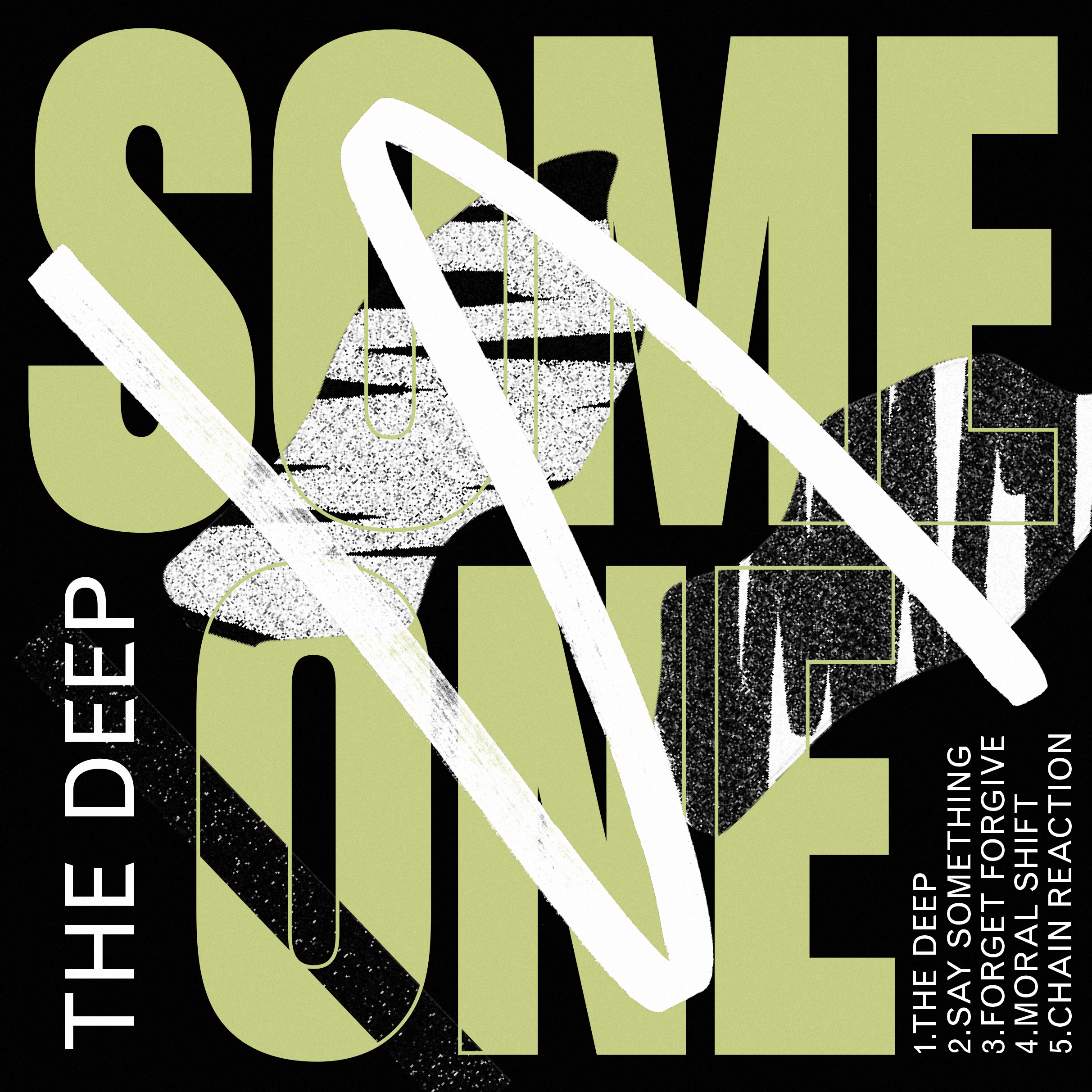
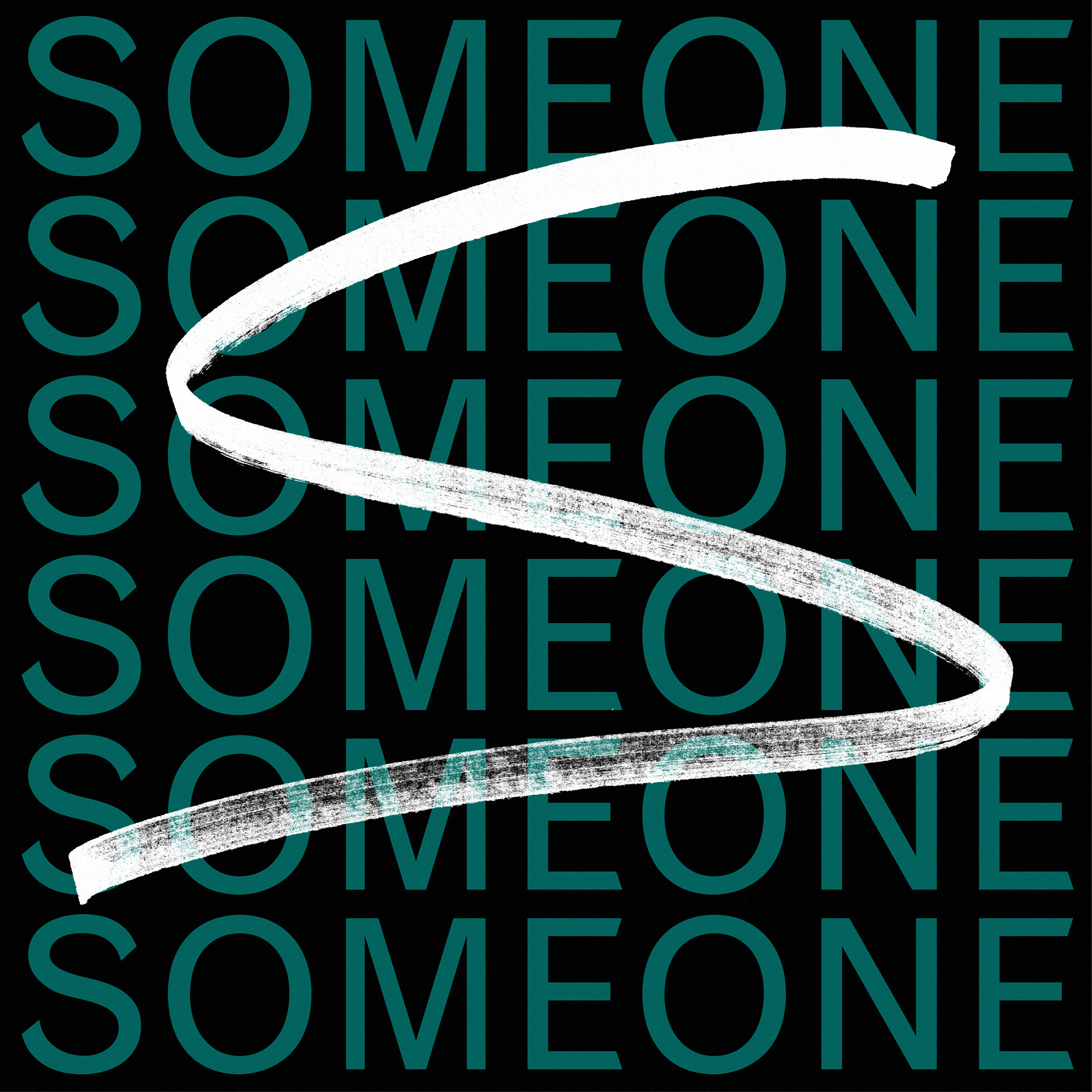
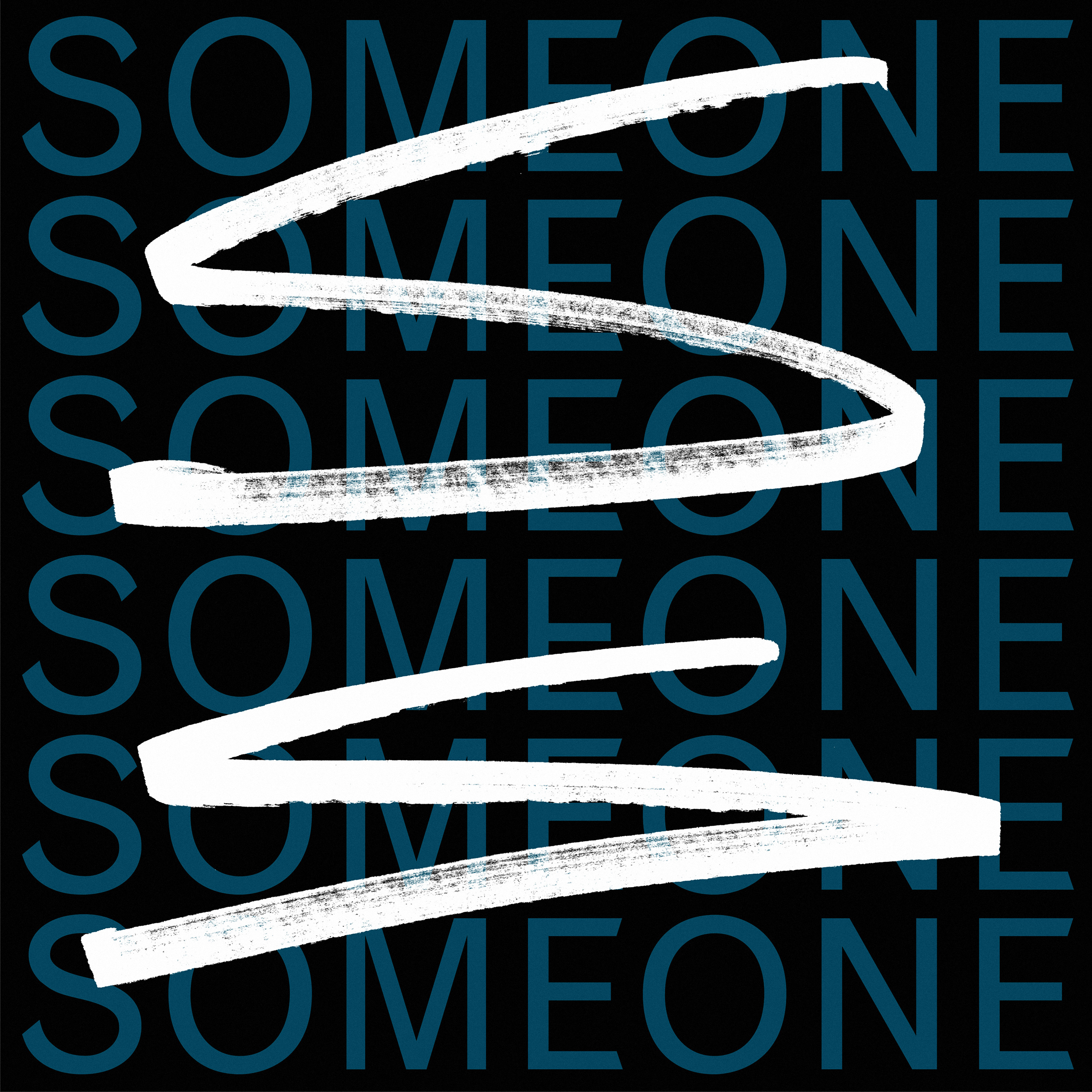
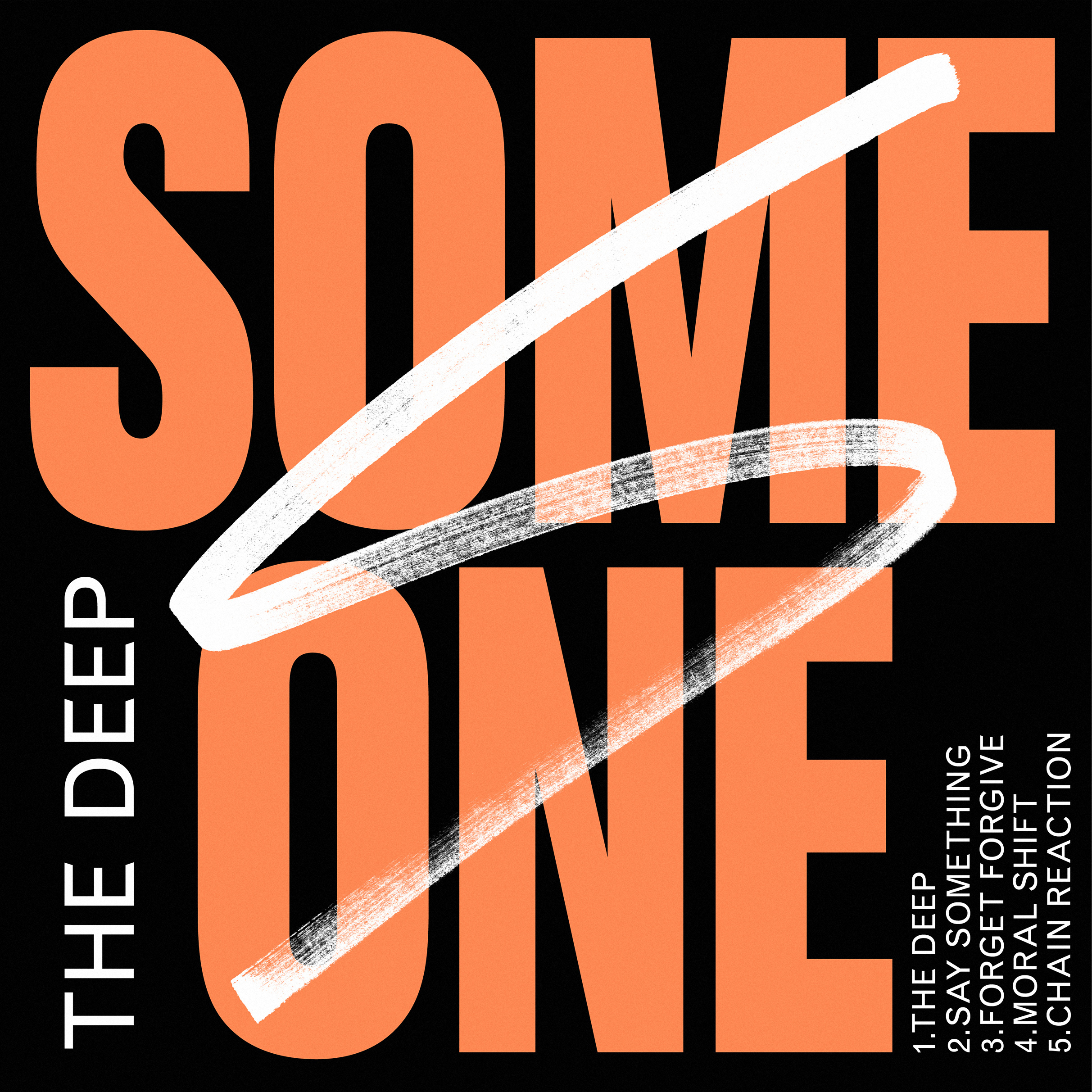
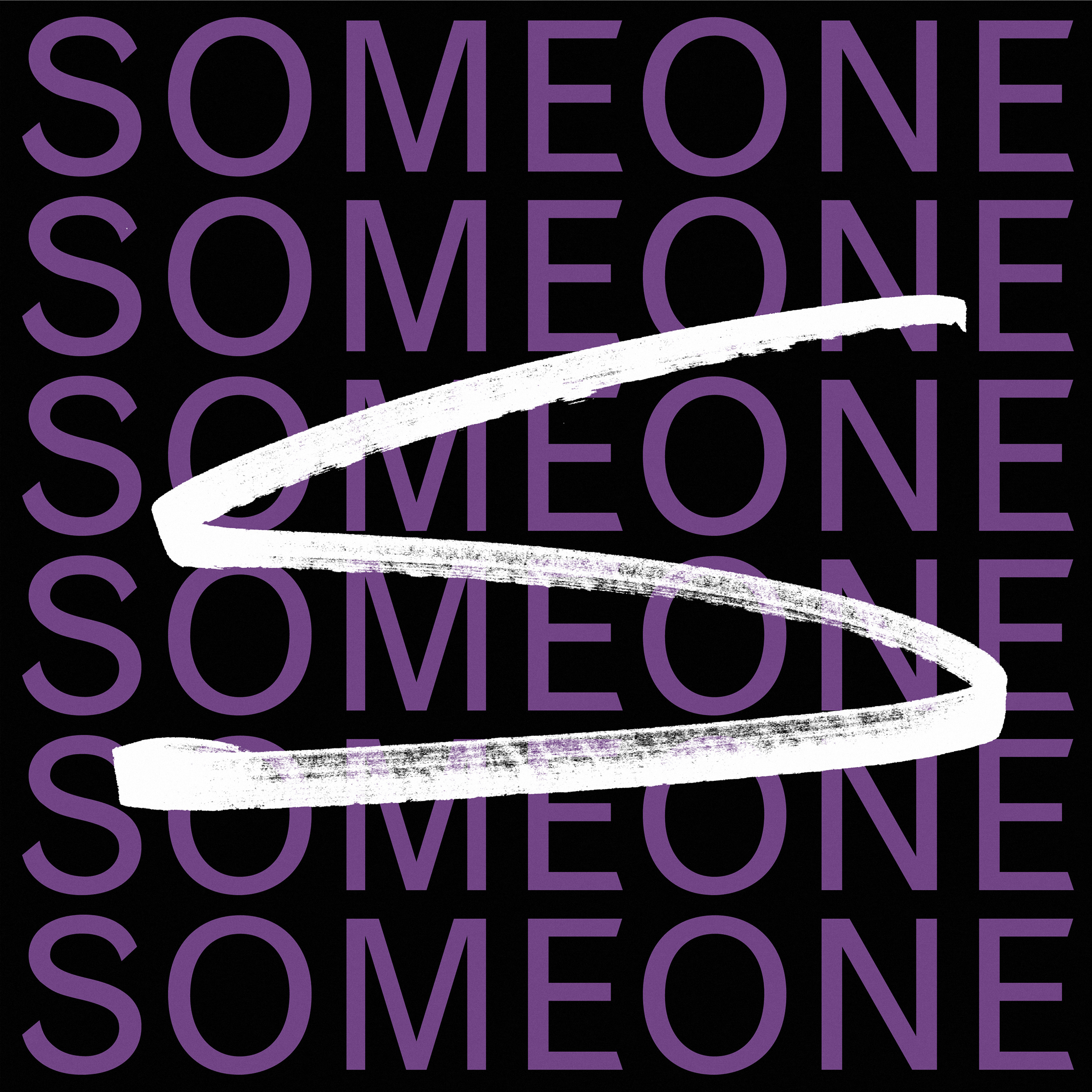
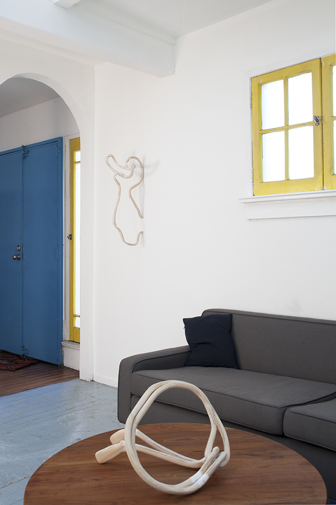
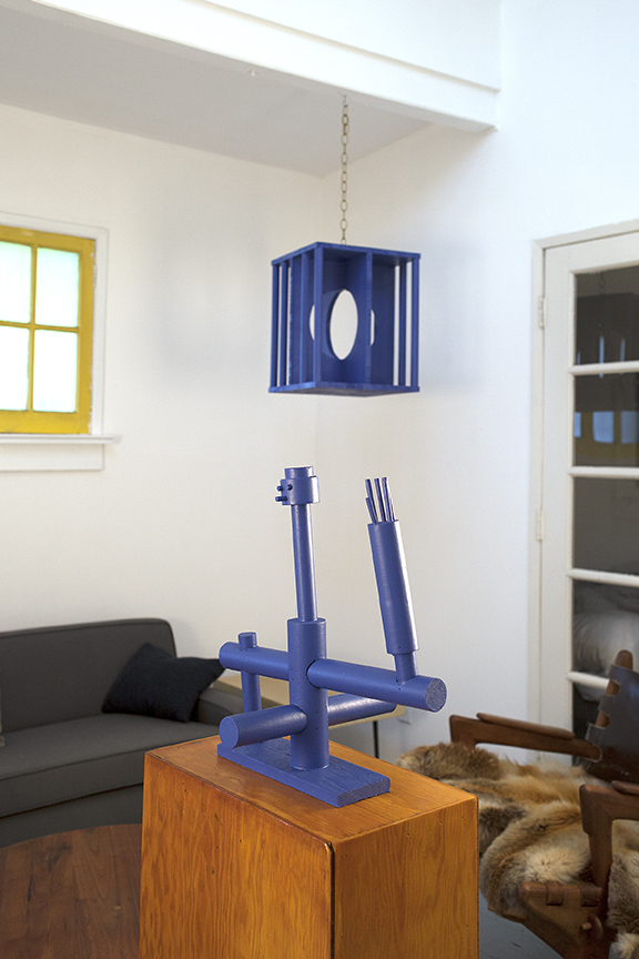
We think of design studio Lennarts & de Bruijn as something like a skilled and droll reaction. So much solid design has emerged from Dutch soil, for so many years, that rhyming seems foolish and insolence mandatory. 🙃

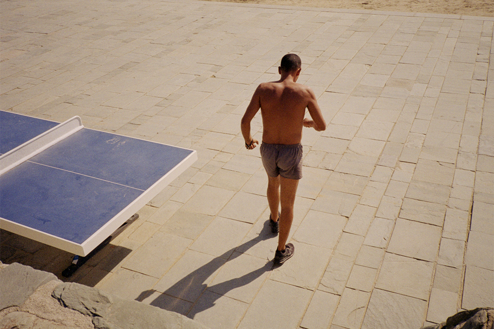
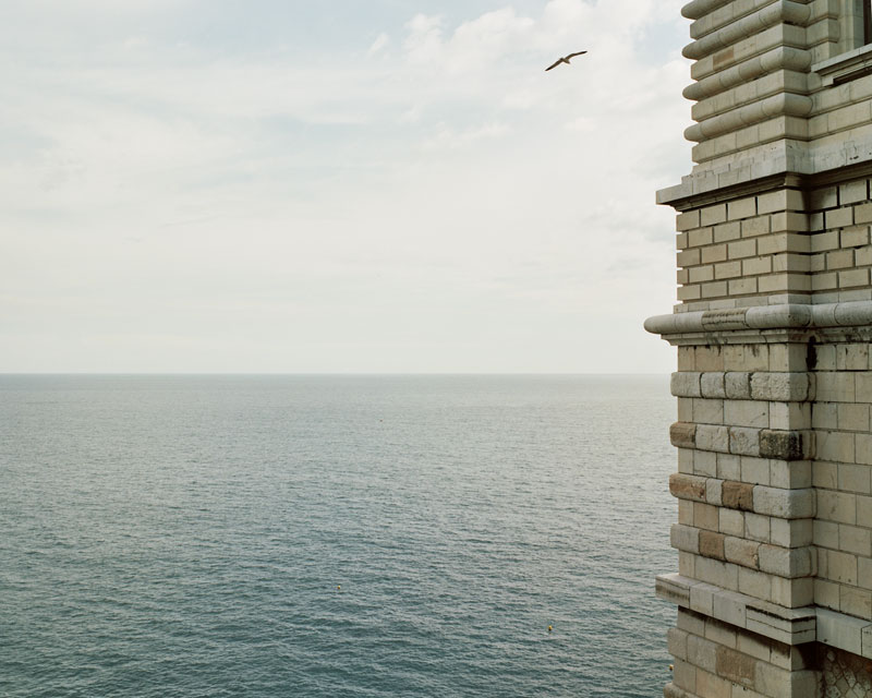
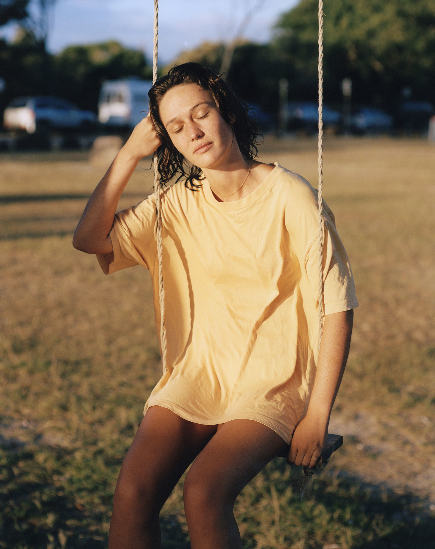
Magdalena Haretche Costa’s photographs are taken in such a way that everyday scenes seem composed rather than improvisationally dimensional.
Chainlink, white water, spray paint, cliff face or sky suggest transparent scrims parallel with the plane of her lens, extending to the farthest obstruction. And somewhere in the layering is what might be called an emotional skin — the effect of which is to tie the whole business together as a gorgeously rich interference pattern.